Fantástica Fábrica
Fantástica Fábrica
Fun Fab is a children’s buffet in Salvador that needed to refresh its brand positioning, verbal identity, and visual identity to remain competitive.
Client
Fantástica Fábrica
Year
2024
Category
Brand Identity

Why
After many years in the market, Fantástica Fábrica had an outdated identity that didn’t express modernity to either parents or children. The brand used complex, three-dimensional illustrations and an excess of colors, both in the environment and across other touchpoints.
After many years in the market, Fantástica Fábrica had an outdated identity that didn’t express modernity to either parents or children. The brand used complex, three-dimensional illustrations and an excess of colors, both in the environment and across other touchpoints.
After many years in the market, Fantástica Fábrica had an outdated identity that didn’t express modernity to either parents or children. The brand used complex, three-dimensional illustrations and an excess of colors, both in the environment and across other touchpoints.
The Concept
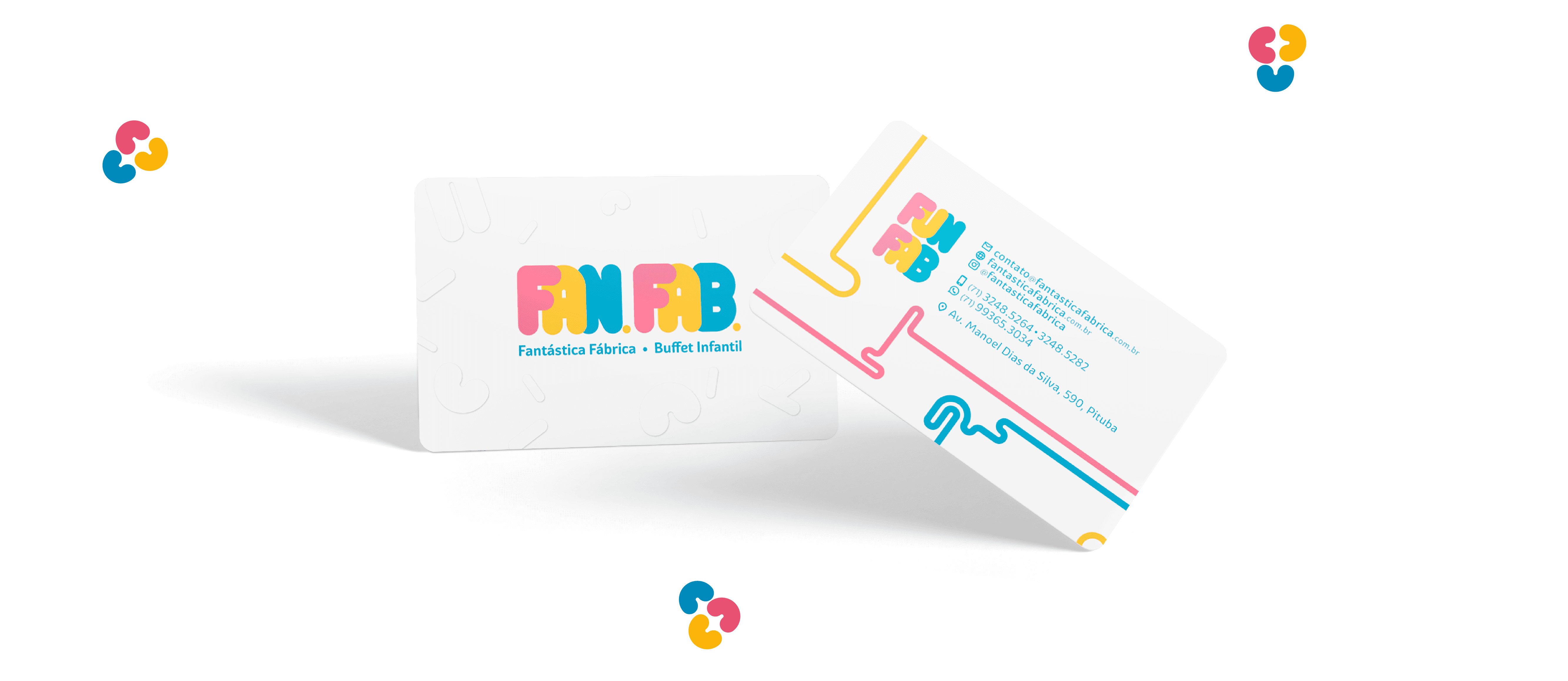
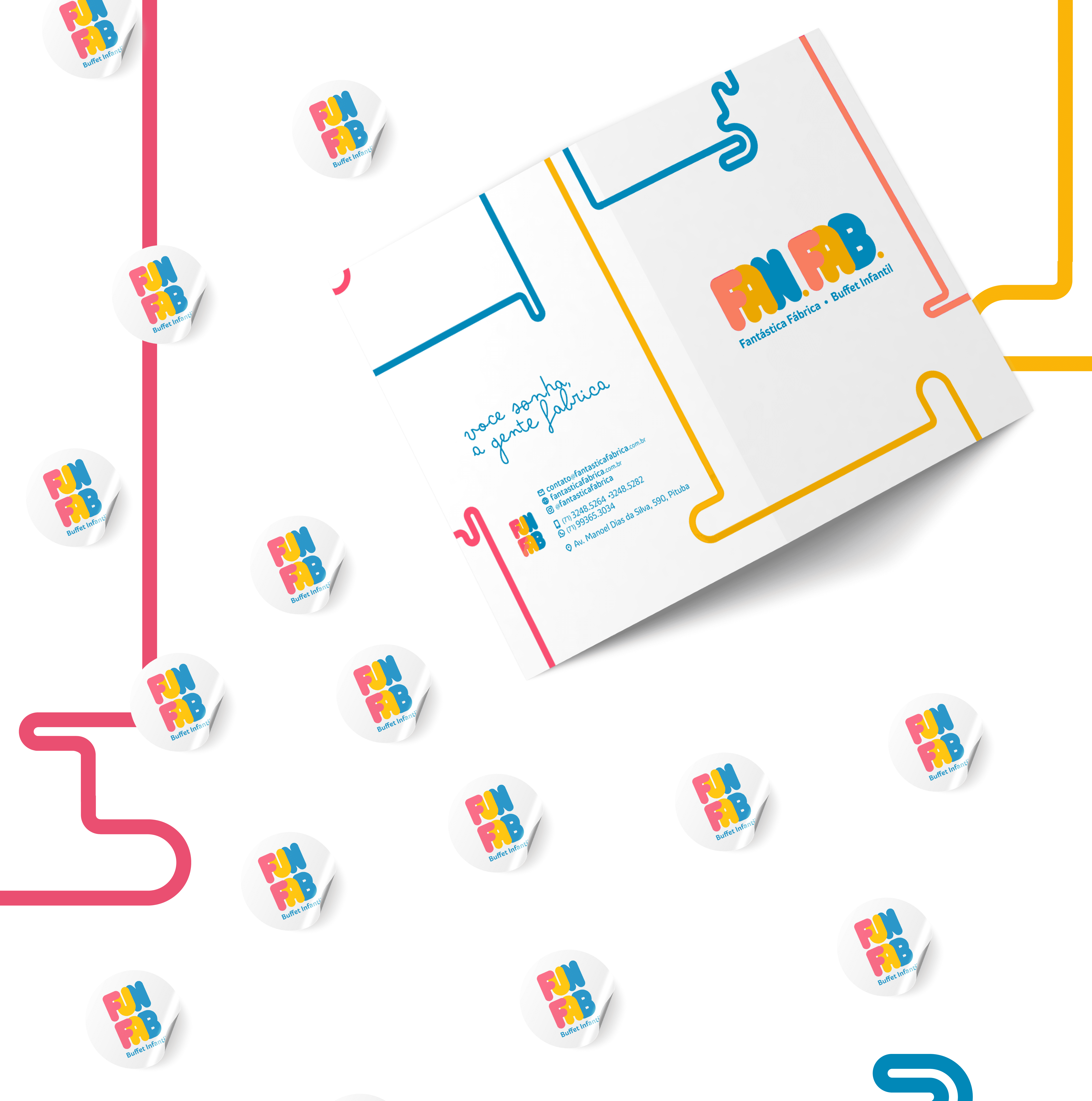
The redesign of Fantástica Fábrica’s visual identity aims to align its positioning with the word “fantástica” (fantastic) while distancing it from the industrial connotation evoked by the word “fábrica” (factory). In the new positioning, “fábrica” is associated with a metaphor for fun production. The colors and visual assets are inspired not only by the children’s universe but also by gaming and arcades, which are prevalent in the buffet’s environment.
The redesign of Fantástica Fábrica’s visual identity aims to align its positioning with the word “fantástica” (fantastic) while distancing it from the industrial connotation evoked by the word “fábrica” (factory). In the new positioning, “fábrica” is associated with a metaphor for fun production. The colors and visual assets are inspired not only by the children’s universe but also by gaming and arcades, which are prevalent in the buffet’s environment.
The redesign of Fantástica Fábrica’s visual identity aims to align its positioning with the word “fantástica” (fantastic) while distancing it from the industrial connotation evoked by the word “fábrica” (factory). In the new positioning, “fábrica” is associated with a metaphor for fun production. The colors and visual assets are inspired not only by the children’s universe but also by gaming and arcades, which are prevalent in the buffet’s environment.
The redesign of Fantástica Fábrica’s visual identity aims to align its positioning with the word “fantástica” (fantastic) while distancing it from the industrial connotation evoked by the word “fábrica” (factory). In the new positioning, “fábrica” is associated with a metaphor for fun production. The colors and visual assets are inspired not only by the children’s universe but also by gaming and arcades, which are prevalent in the buffet’s environment.


How
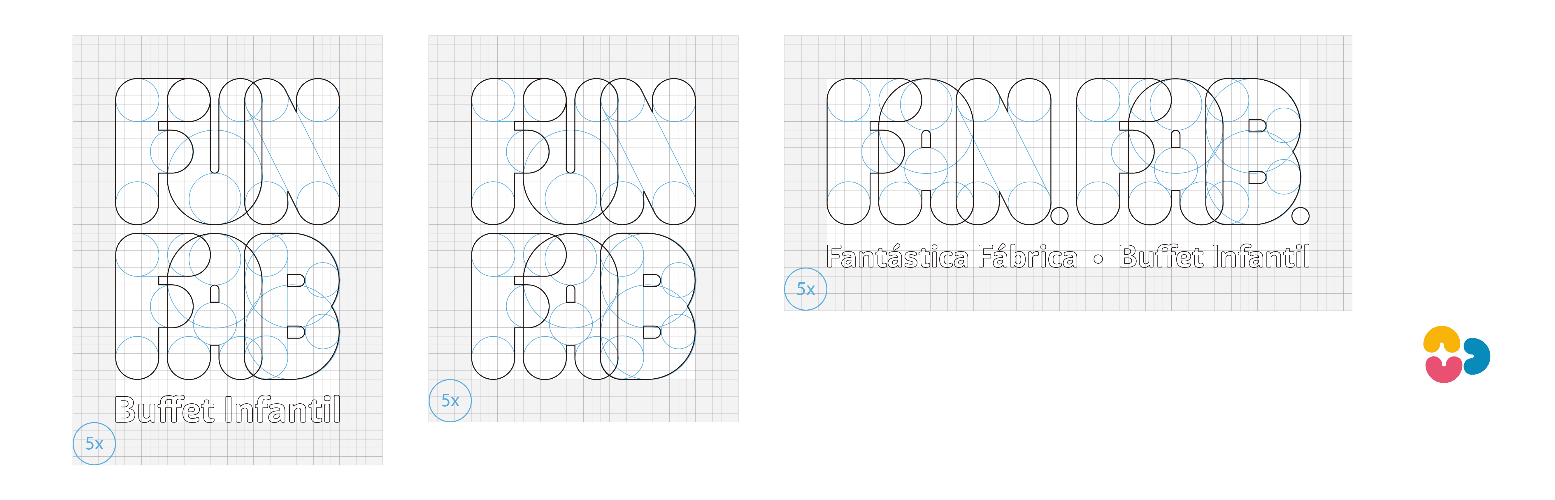
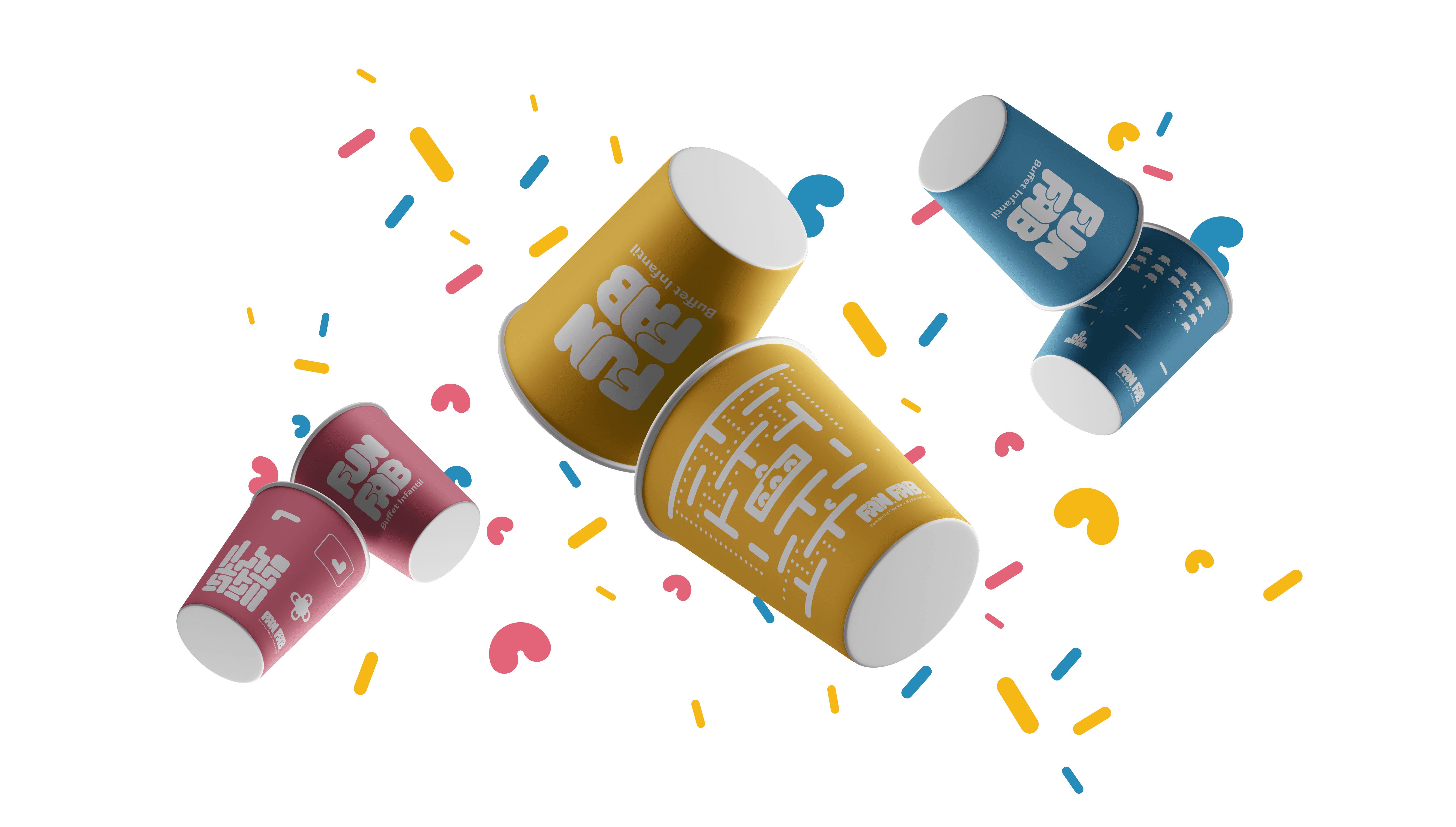
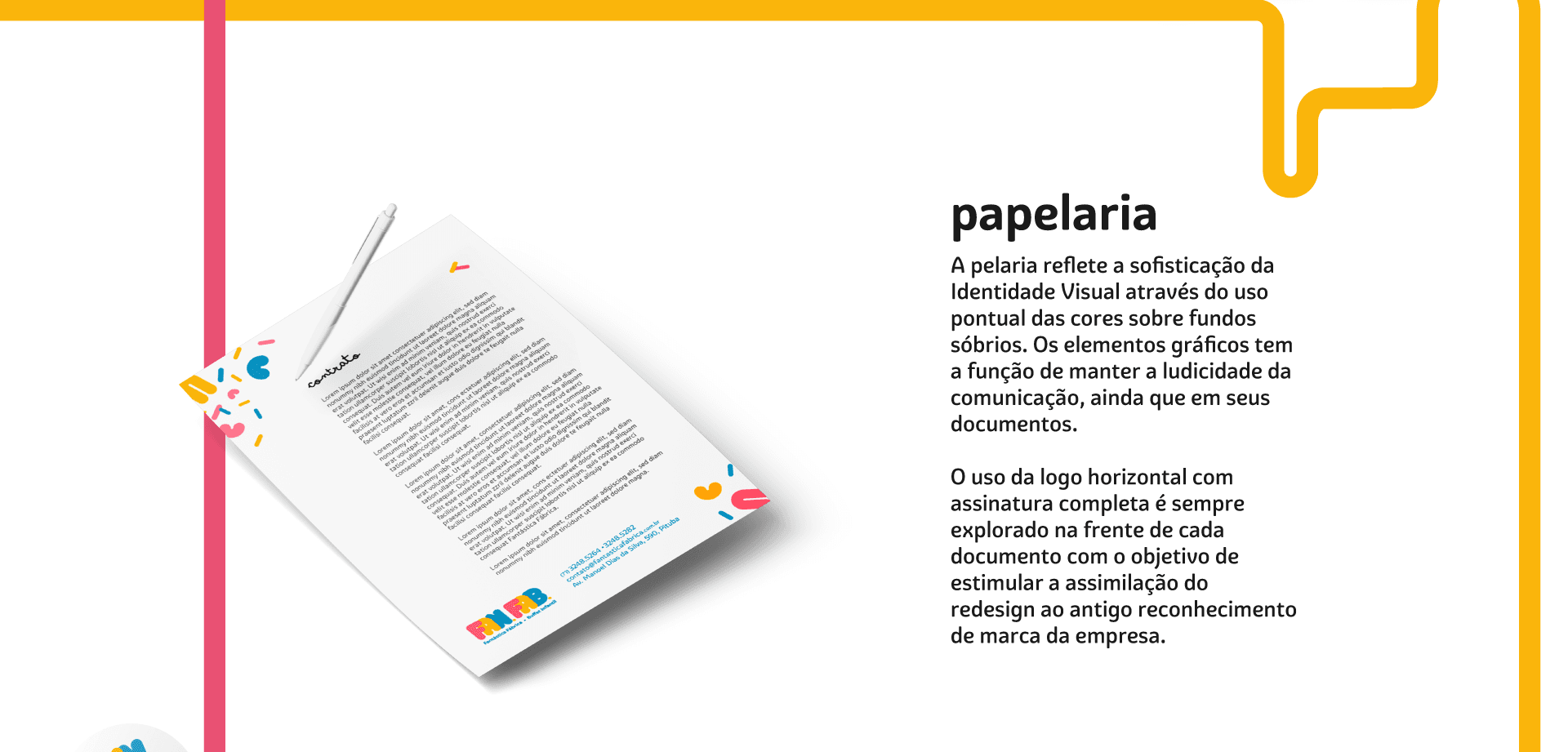
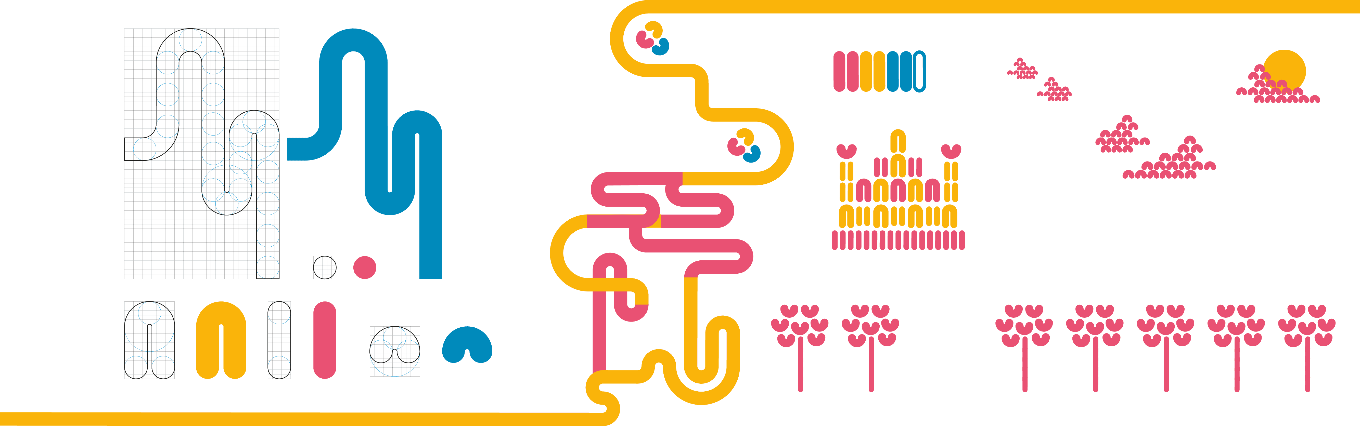
Inspired by building toys, the vector illustrations that make up the visual identity follow the same constructive logic as the logo. All elements are formed by moving circular points, aiming to convey a friendly, approachable feeling. Additionally, the faded colors against a white background give the brand a playful, yet sophisticated and modern touch.
Inspired by building toys, the vector illustrations that make up the visual identity follow the same constructive logic as the logo. All elements are formed by moving circular points, aiming to convey a friendly, approachable feeling. Additionally, the faded colors against a white background give the brand a playful, yet sophisticated and modern touch.
Inspired by building toys, the vector illustrations that make up the visual identity follow the same constructive logic as the logo. All elements are formed by moving circular points, aiming to convey a friendly, approachable feeling. Additionally, the faded colors against a white background give the brand a playful, yet sophisticated and modern touch.
Inspired by building toys, the vector illustrations that make up the visual identity follow the same constructive logic as the logo. All elements are formed by moving circular points, aiming to convey a friendly, approachable feeling. Additionally, the faded colors against a white background give the brand a playful, yet sophisticated and modern touch.

Research
The decisions made in this project were primarily based on market research and customer experiences with the business itself. In addition, academic articles were used to study children’s visual perception, and many inspiring visual references were collected from toys, movies, and more.
The decisions made in this project were primarily based on market research and customer experiences with the business itself. In addition, academic articles were used to study children’s visual perception, and many inspiring visual references were collected from toys, movies, and more.
The decisions made in this project were primarily based on market research and customer experiences with the business itself. In addition, academic articles were used to study children’s visual perception, and many inspiring visual references were collected from toys, movies, and more.
The decisions made in this project were primarily based on market research and customer experiences with the business itself. In addition, academic articles were used to study children’s visual perception, and many inspiring visual references were collected from toys, movies, and more.

More Works More Works
More Works More Works


©2025 SAAL DESIGN
GO BACK TO TOP
©2025 SAAL DESIGN
GO BACK TO TOP