OTA PORTAL
OTA PORTAL
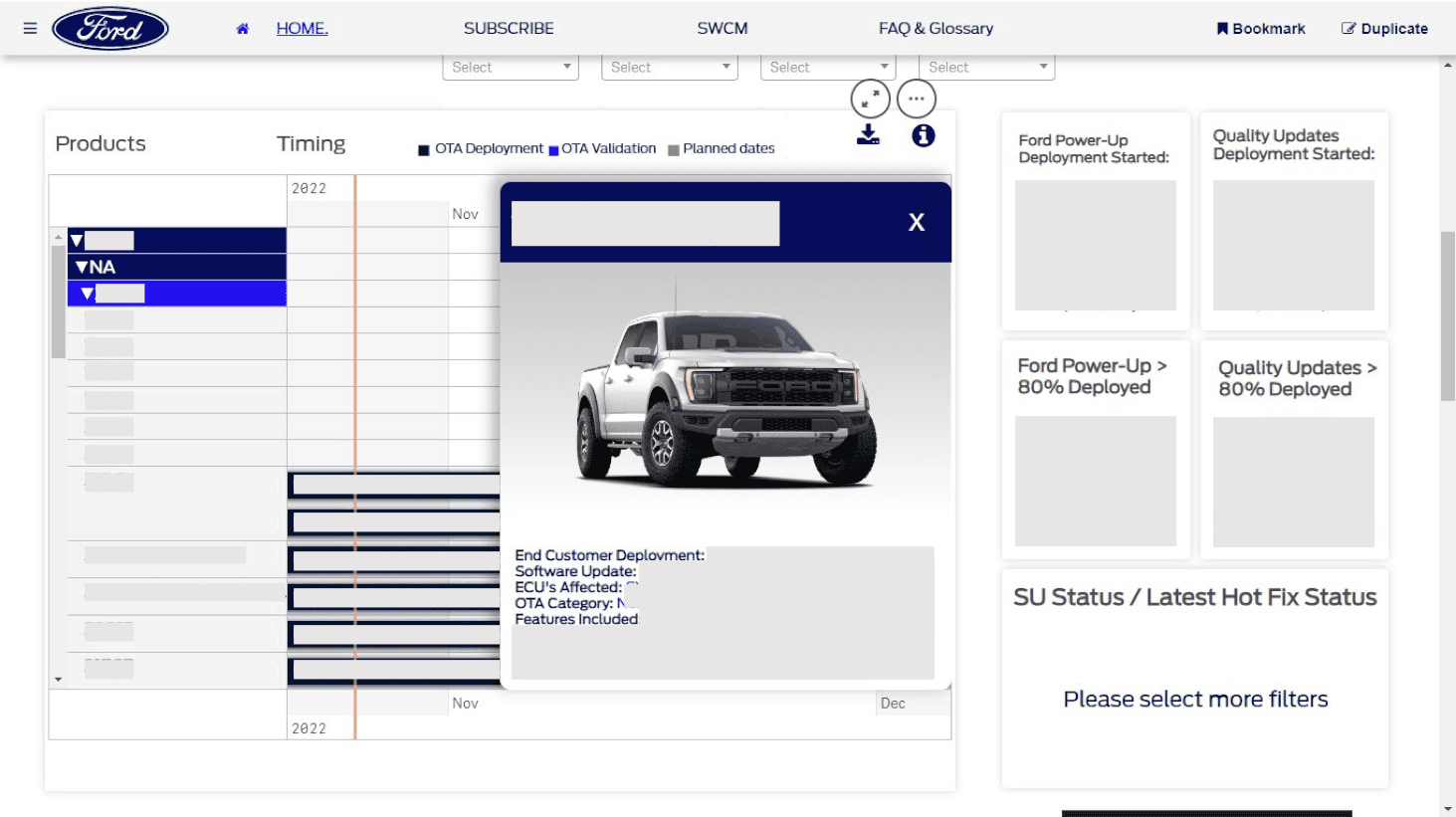
The OTA Portal was a dashboard developed in Qlik Sense to organize and consolidate data from various Over-The-Air (OTA) teams, each with different tools and data collection methods. This product aimed to facilitate communication between all teams, their managers, and the general director by gathering and updating this information digitally.
Client
Ford Motor Company
Year
2022-23
Category
Product Design

Non-disclosure Agreement
Working for Ford in the automotive industry meant being bound by NDAs. The following references are non-revealing, consented, public information or pertain to completed and discontinued projects. However, I can share insights into my personal experiences, the methodologies employed, and the skills I developed while working on various initiatives. These examples highlight my contributions and professional growth without disclosing any proprietary or confidential information, ensuring full compliance with legal and ethical obligations.
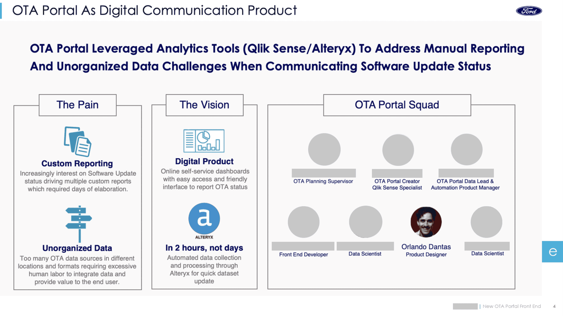
Chapter 1 – From Chaos to Clarity: Tackling the OTA Portal Challenge
Specific goals
• Identify barriers to the tool usage and foster its adoption.
• Understand user pain points and needs to identify opportunities.
• Redesign the portal to enhance its usefulness, usability, and visual appeal.
Outcomes
• Redesign of the OTA Portal.
• Insights on how to improve data standardization and information exchange between teams.
• Suggestions for strategic actions to inform and educate both new and existing members of the OTA teams.
Why the Portal was created
The OTA Portal was initially created to streamline the flow of information from the Brazilian team to the North American team, particularly for a major meeting with the department director. The f irst prototype successfully reduced the time spent collecting and organizing data from a week to a single day, quickly becoming a valuable tool for that team. However, the next step was to expand its use across all OTA teams, consolidating data communication.
The first prototype & my mission
When I joined the team, the portal was already functional but far from user-friendly. Users struggled to navigate it, and the development team faced challenges promoting its adoption across OTA teams. My mission was to redesign the portal to improve usability, foster adoption, and align it with the needs of all stakeholders, from team members to top-level executives.
My role as a designer team of one
As the sole designer in a small team, I was tasked with managing the entire design process—from research to prototyping—and making the user-friendly and visually appealing.
Conflicting opinions and user resistance to use the Portal
The most significant challenge was reconciling conflicting opinions and interests among users, from team members to management. There was considerable disagreement over how data should be collected, presented, and distributed. Additionally, many questioned whether the portal was redundant, as other tools were already being used for similar purposes
Chapter 2 – Breaking Barriers: Insights from Research & Testing
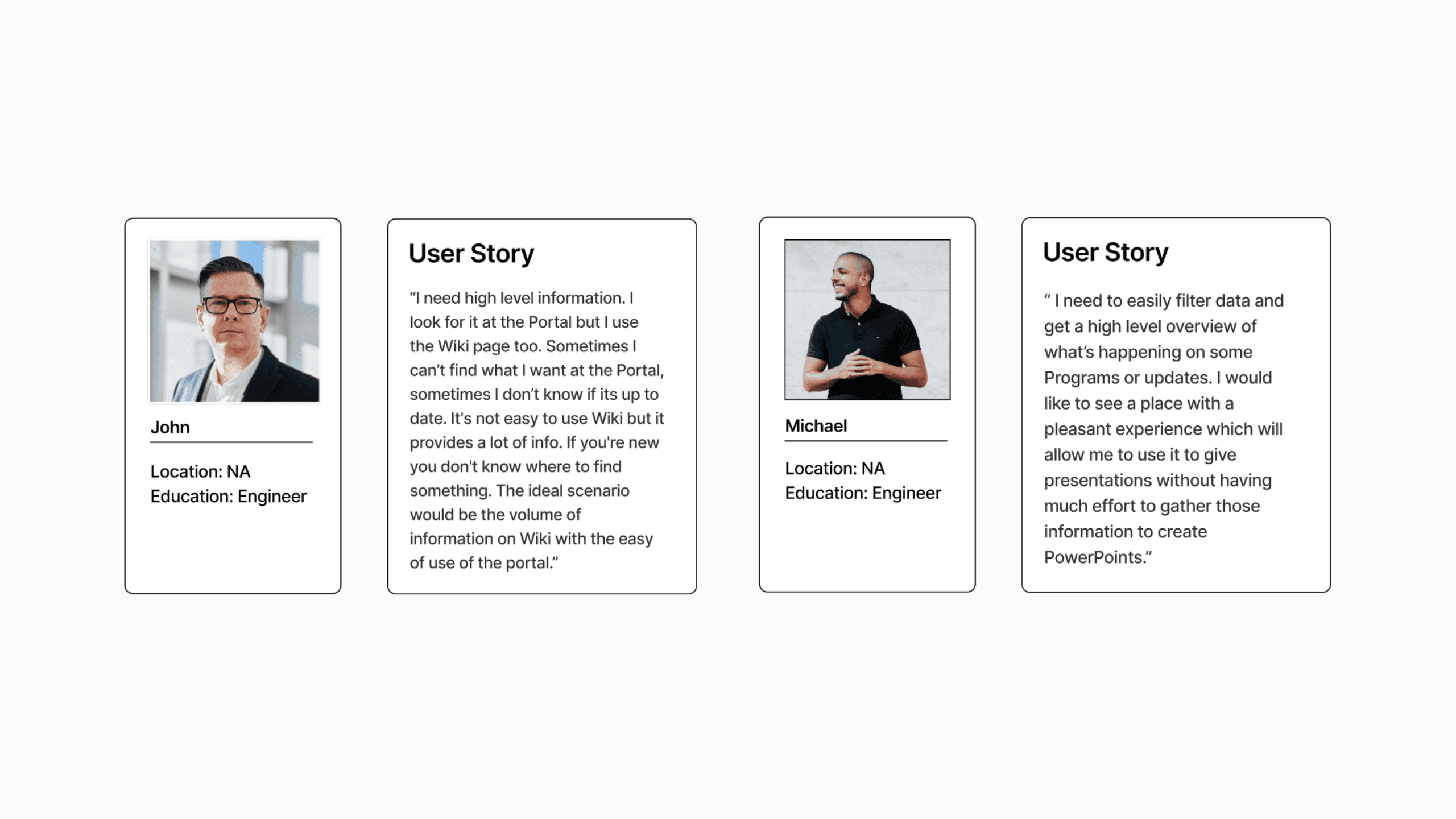
Scope of research and testing phases for the existing prototype
Although we had a tight timeline, we decided to follow a lean version of the Design Thinking process to ensure user centric design. For the existing prototype, we conducted: Desk research; 5 user interviews; 5 usability tests; 2 surveys; A heuristic evaluation; Quantitative analysis of Qlik Sense-generated data;
Gathering reports through various means
Although we formally conducted five interviews via WebEx, we heavily relied on informal discussions. Scheduling with managers and directors was challenging, especially with those less enthusiastic about the initiative. To address this, we adopted a friendly, engaging approach in emails and chats, gathering valuable insights without overburdening respondents.
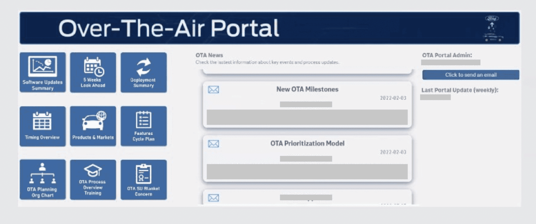
Barriers to the use of the Portal
We realized the Portal needed to be exceptionally user-friendly, especially since the teams were hesitant about adopting a new platform that might significantly disrupt their workflow or involve a steep learning curve. One unique challenge was the inconsistent terminology and codes used across OTA teams. Neither we nor the interviewees fully understood some of these, which required refining how data was labeled and displayed on the dashboard.
Strengths and weaknesses revealed by testing
Usability testing revealed strengths and weaknesses in the portal. While users appreciated the data on timing, deployment, and updated content, they struggled with confusing navigation, inconsistent terminology, and excessive pages. Conducting tests remotely using WebEx highlighted the need to make the most of existing resources in a large organization like Ford.
Scope of research and testing phases for the existing prototype
Although we had a tight timeline, we decided to follow a lean version of the Design Thinking process to ensure user centric design. For the existing prototype, we conducted: Desk research; 5 user interviews; 5 usability tests; 2 surveys; A heuristic evaluation; Quantitative analysis of Qlik Sense-generated data;
Gathering reports through various means
Although we formally conducted five interviews via WebEx, we heavily relied on informal discussions. Scheduling with managers and directors was challenging, especially with those less enthusiastic about the initiative. To address this, we adopted a friendly, engaging approach in emails and chats, gathering valuable insights without overburdening respondents.
Barriers to the use of the Portal
We realized the Portal needed to be exceptionally user-friendly, especially since the teams were hesitant about adopting a new platform that might significantly disrupt their workflow or involve a steep learning curve. One unique challenge was the inconsistent terminology and codes used across OTA teams. Neither we nor the interviewees fully understood some of these, which required refining how data was labeled and displayed on the dashboard.
Strengths and weaknesses revealed by testing
Usability testing revealed strengths and weaknesses in the portal. While users appreciated the data on timing, deployment, and updated content, they struggled with confusing navigation, inconsistent terminology, and excessive pages. Conducting tests remotely using WebEx highlighted the need to make the most of existing resources in a large organization like Ford.


Chapter 3 – Transformative Insights: Designing for Usability and Impact
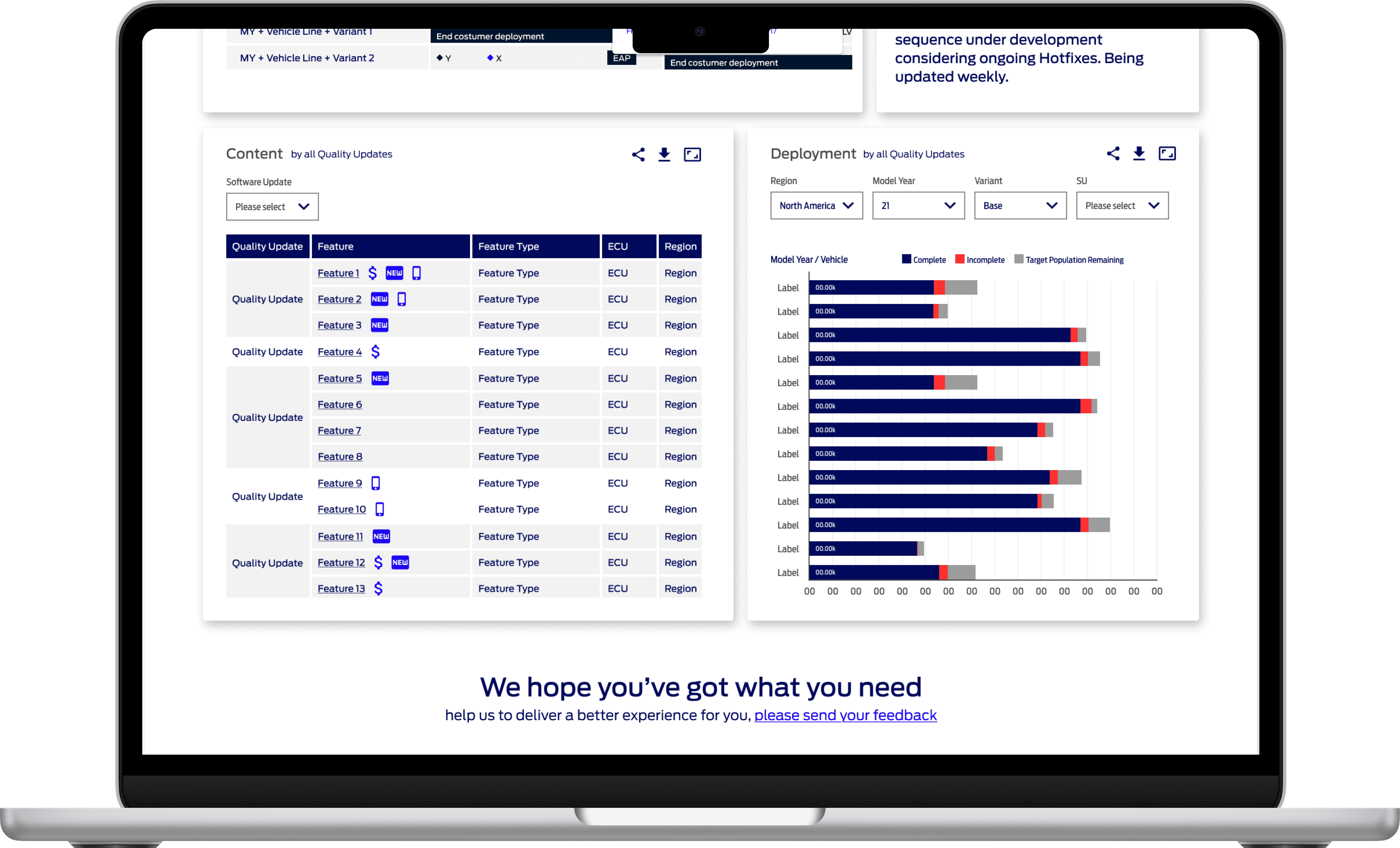
We decided to consolidate the dashboard into a one-page high-level overview. This new design focused on the three core tools users relied on: Timing, Deployment, and Content graphs. Our goal was to make the interface suitable for both data exploration and quick presentations.
Key changes
Streamlined Navigation: All key information was visible on a single page.
Custom Filters: Mapped out filters to handle the vast amount of data, including cars, dates, updated content, features, hotfixes, and regions.
Supplementary Pages: Addressed user pain points with pages explaining OTA terms, linking to complementary tools, and providing updates from the area.
To ensure the product's longevity, we proposed subscription features for updates and feedback forms for active users.
The prototyping process
I collaborated with the project lead and the developer to refine wireframes in Figma, which were then tested in Qlik Sense. This iterative approach allowed us to integrate user feedback quickly. The prototyping phase included new usability tests, additional interviews, and surveys. These iterations culminated in a final presentation to the director of the OTA area.


Chapter 4 – Iteration in Action: Refining the Portal
Aesthetics in Qlik Sense: Expectation vs Reality
While Qlik Sense is excellent for dashboards, it lacked the customization needed for the web app-like appearance our manager desired, so we conducted multiple iterations to refine the interface's aesthetics and functionality.
Our delivery and value-added extras
Usability testing revealed challenges with filtering the vast dataset, as each user needed highly specific information. While we couldn't address all communication gaps, we suggested standardizing terminology across teams and creating informational pages to enhance user understanding.
Due to prioritization needs, we focused on delivering the core dashboard while presenting additional features for future updates. Suggestions beyond our scope were pitched as value added extras.

Chapter 5 – Lasting Impact: Outcomes and Lessons Learned
The redesigned OTA Portal gained broader acceptance across teams in Brazil and the U.S. While it remained in use for some time, its key features were eventually integrated into another platform as part of a broader organizational effort to streamline tools.
Our team transitioned to creating more tailored dashboards for managers and directors and redesigning wiki pages to address similar pain points. The portal’s methodologies and learnings became a foundation for these new initiatives.
More Works More Works
More Works More Works


©2025 SAAL DESIGN
GO BACK TO TOP
©2025 SAAL DESIGN
GO BACK TO TOP